
Correlation & Scatter Diagrams
In order to understand correlation and regression, students must first be familiar with scatter diagrams and the idea of a line of best fit.
Scatter Diagrams

Bivariate data is essentially data that comes in pairs, e.g (height, weight). This is different to univariate date (seen in histograms, cumulative frequency diagrams or boxplots) where only single values are given in a dataset. Bivariate data is often displayed on a scatter diagram. One of the variables is independent (or explanatory), usually shown on the x-axis, and the other is the dependent variable (or response variable), usually on the y-axis. When the variables are correlated, a change in the independent variable causes (not always directly – see more details below) a change in the dependent variable. This is determined by the correlation. The line of best fit (see Regression below) is the line that shows the trend in the data (if any) and gives an indication of the strength of the correlation between the two variables.
What is Correlation?
In statistics, correlation measures the strength of a linear relationship in bivariate data. If the data points are close to a straight line, the correlation is said to be strong. On the other hand, if there are a lot of large gaps, the correlation is said to be weak. Note that weak/strong does not indicate whether the linear relationship is positive or negative. See Regression below for more on this.

Weak and positive
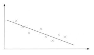
Strong and negative
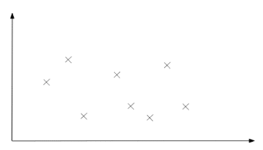
No correlation
For variables that are positively/negatively correlated, as one goes up the other goes up/down. Variables that have no correlation have no effect on each other. It is possible to generate a number between -1 and 1 that indicates how strong the linear relationship is for bivariate data. This number, called the Product Moment Correlation Coefficient (or PMCC or Pearson Correlation Coefficient), also indicates whether the linear relationship is positive or negative. See more on the PMCC. It is possible that you do not need to know correlation in this much detail – be sure to check your syllabus.
Correlation vs Causation
It is important to note that, even for a strong correlation, it doesn’t necessarily imply causation. Two variables are said to have a causal relationship if a change in the explanatory variable causes a change in the response variable directly. For example, a rise in temperature might cause a rise in the number of ice creams sold – temperature and ice creams sold have a causal relationship and a strong correlation might be seen. However, correlation doesn’t necessarily imply causation. One would probably see a correlation between ice creams sold and the number of active viruses, say. One does not cause the other but rather there is a hidden factor, temperature, that is impacting both separately. Consider the example carefully when deciding if there is a causal relationship present.
Regression
For correlated data, chances are you would have been asked to draw the line of best fit on a scatter diagram before. This is known as regression – more often than not, the line that minimises the total differences between the line and the points is fitted. Find out more about least squares regression. As mentioned above, the gaps give an indication of the strength of the correlation between the two variables. Note that if there is no correlation, regression makes no sense – you can’t fit a line to data that appears to have no linear relationship.

The correlation is positive if the line of best fit has a positive gradient and vice versa. Conversely, the correlation is negative if the line of best fit has a negative gradient. Note that weak/strong with positive/negative says nothing about how steep the line of best fit is. This can be determined from the equation of the line of best fit:  . Check your syllabus to see if this equation is given or if you need to use a calculator to find it. As expected, a determines where the line crosses the y-axis and b is the gradient. If b is positive/negative then the correlation is positive/negative.
The equation for the line of best fit can be used to make predictions for values that are not observed. Interpolation is when this is done within the range of data values already provided – see example below or more on interpolation. Extrapolation is when this is done outside of the observed range and should be exercised with caution – the data may not follow the same trend for values beyond what is given. See more on this in the example.
Examples
The following table shows the heights and weights of 12 randomly selected individuals:
| H (cm) | 150 | 176 | 190 | 154 | 181 | 161 | 192 | 172 | 166 | 157 | 185 | 163 |
| W (kg) | 60 | 70 | 73 | 62 | 74 | 62 | 77 | 68 | 68 | 58 | 69 | 64 |
1. Produce a scatter diagram to display the data and comment on the correlation, if any, and the suitability of linear regression.
2. Determine whether the relationship between the two variables is causal or not.
It can be shown that the line of best fit is approximately given by  .
.
3. Interpret the coefficient of H in the relationship between H and W.
4. Find an approximation for the weight of a person given that their height is 170cm and comment on the suitability of using this estimate. Find an approximation for the height of an individual given that their weight is 100kg and comment on the suitability of using this estimate.

1. The scatter diagram suggests that there is a strong positive correlation between the heights and the weights. Since there is a correlation between the two variables, a linear relationship exists and it makes sense to find the straight line that best fits the data. That is to say, linear regression is appropriate here.
2. It seems reasonable to assume that an increase in height has a direct effect in increasing the weight and so it is safe to say that the relationship is causal.
3. The coefficient of H is 0.387. This is the gradient of the line of best fit and suggests that for every 1cm increase in height corresponds to a 0.387kg increase in weight.
4. The equation gives the weight of a person of height 170cm as  . This is interpolation since 170cm is within the range of heights seen in the data and is a suitable estimate to use. The equation can be inverted to find H in terms of W:
  and so the height of a person who weighs 100kg is estimated at 255.587cm. This is extrapolation as 100kg is outside the range of weights seen in the data. This is un unsuitable estimate since we do not know if the data continues to follow the linear relationship. In fact, we know that it does not – weight is not limited as height is in the average individual.