
Box Plots
Box plots (or box and whisker plots) provide a convenient way to look at the distribution of a dataset by first identifying the quartiles. Outliers are those values which do not seem to fit with the rest of the data very well. This page will show you how to identify outliers as well as construct box plots and use them in statistical analysis. Note that you may be asked to do this for a given dataset but you may also be asked to do it for a dataset that you are already familiar with. See more on this.
In order to draw a box plot for a given set of data, one must know the lowest value, the lower quartile (Q1), the median (Q2), the upper quartile (Q3) and the largest value. See more on measures of central tendency and measures of variation. In addition, the possibility of there being outliers and anomalous data entries must be considered. Outliers are determined by a given rule and are usually identified on a box plot by a cross. See more on outliers below. As opposed to a cumulative frequency diagram, values on a box plot are identified horizontally:
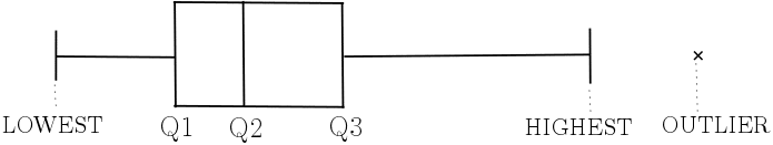
The gap between the lowest value and Q1 is joined by a horizontal line. This is also true for the gap between Q3 and the highest value. The gaps between Q1/Q2 and Q2/Q3 are shown with boxes. Each of the gaps represent intervals that contain 25% of the data excluding any outliers. This allows the reader to see the ‘spread’ of the data (see ‘Measures of Variation‘). See Example 1 for an example of how to construct a box plot and Example 2 for a demonstration of how to ‘clean’ the data of anomalies and identify outliers before constructing the box plot for a given dataset. Note that some of the significant data points coincide – also see Example 2 for this.
Outliers
Outliers are values in a dataset that appear to be suspicious in that they don’t seem to fit with the other data values. Some outliers are valid and should be kept as they legitimately affect the measures of central tendency and variation. Others, however, should be removed before any analysis is performed as they are present, for whatever reason, due to error. These outliers are known as ‘anomalies‘. The process of removing anomalies is known as ‘cleaning the data’.
In order to find an outlier (anomaly or not), a rule for identifying outliers must be specified. These are commonly given as follows:
- An outlier may be identified as any value less than
 or more than for some specified value m….
 - …or an outlier may be identified as the
 for some specified value n.
 or more than
  for some specified value m….
 for some specified value n.
See more on the quartiles and the interquartile range (IQR) or click here for more on mean and standard deviation. See Example 2 below for a demonstration of identifying outliers and cleaning data before constructing a box plot.
Examples
This dataset shows the ages of 15 female gorillas kept at a conservation park in the Congo:
8, 30, 5, 14, 61, 15, 52, 25, 22, 32, 43, 7, 41, 18, 55
1. Identify the outliers, if any, for this dataset using the following rule for outliers:
either less than  or more than
2. Construct a box plot to display the ages of the female gorillas.
The statistics of the male gorillas at the same conservation park are calculated as follows:
Lowest=2, Q1=10, Median=22, Q3=34, Highest=53
3. Compare the ages of the female gorillas with the ages of the male gorillas.
Solution:
1. First of all, write the ages of the female gorillas in ascending order:
5, 7, 8, 14, 15, 18, 22, 25, 30, 32, 41, 43, 52, 55, 61
The median can now be identified (in blue) as well as Q1 and Q3 (in red). See more on quartiles. Hence, the interquartile range is 43-14=29. It follows that  and
and  . None of the ages fall below the lower bound and none above the upper bound and so there are no outliers for this dataset.
2. 
3. By adding a box plot for the male gorilla’s ages to the same plot as the female’s, comparison of the two datasets is made more simple:

We can see from this that, in general, the male gorillas are younger than the female gorillas. The other most significant difference between the two is that the interquartile range is smaller, meaning that this 50% of male gorillas are within a smaller range. We can also see that the Q1 to Q2 and Q2 to Q3 ranges for male gorillas are the same whereas for the female gorillas, the Q2 to Q3 range is much larger than that of Q1 to Q2. This means that the ages of this 25% of female gorillas is more spread out.
Note that, in an exam setting, if the question is worth three marks, then you should make three different comparisons between the two datasets.
Click here for more statistical analysis using this example (Ranges – Example 1).
The following dataset shows the weights of 8 newborn babies recorded by a labour unit in one hour at a given hospital:
2.6kg, 58kg, 3.3kg, 2.8kg, 0.7kg, 4.1kg, 3.5kg, 3.9kg
- Clean the dataset and identify any outliers that occur greater than two standard deviations away from the mean.
- Show the clean dataset in a box plot.
Solution:
- Quite clearly, 58kg is not just an outlier, it is an anomaly. We cannot be certain if it should be 5.8kg, as this weight also looks high for a newborn, and so it must be removed from the dataset. The clean dataset is therefore: 2.6kg, 3.3kg, 2.8kg, 0.7kg, 4.1kg, 3.5kg, 3.9kg. The mean and standard deviation can be calculated as follows:
 to 3 decimal places. See more on mean and standard deviation. It follows that the boundaries for outliers are 0.868kg and 5.104kg. The only measurement that falls outside the appropriate range is 0.7kg – this is an outlier. It is possible that this data value is valid, especially if this baby was premature, and so we do not remove it from the dataset.
 - Putting the clean dataset in the correct order, we can identify the quartiles: 0.7kg, 2.6kg, 2.8kg, 3.3kg, 3.5kg,3.9kg, 4.1kg.
 Notice that, since 0.7kg is an outlier, the lowest value is considered to be 2.6kg, hence the lowest value and Q1 coincide. (This is why the first whisker appears to be missing.)
 to 3 decimal places. See more on