
Histograms
Histograms provide a useful way to display data and its distribution. Students often get confused between histograms and bar charts. However, histograms and bar charts are different in a number of ways. Firstly, histograms are used to present continuous grouped data whereas bar charts are used to display ordinal, nominal or discrete data. Click here to see some examples of bar charts. Secondly, bar charts are usually used to compare data whereas a histogram shows the distribution of the data. Note that you may be required to produce or interpret histograms for a given dataset but you may also be asked to do it for a dataset that you are already familiar with. See more on this.
The most important aspect of histograms is that they are not plotted against frequency, they are plotted against frequency density. This means that the frequency is represented in the area of the bar.

Since the area of a rectangle is width multiplied by height, we have:
FREQUENCY = FREQUENCY DENSITY  INTERVAL WIDTH
See the worked example for an application of this. Note that the area may be exactly the frequency but it is also possible to use proportional areas. In these cases:
FREQUENCY =  AREA
AREA
where  – see Example 1. If the interval widths are uniform, a frequency polygon (see more on Frequency Polygons) can be added to a histogram by joining up the midpoints of the top of each bar of the histogram with straight lines. See Example 1d. Histograms also provide a convenient way to look at the ‘spread’ of data (see Measures of Variation) and connect to probability distributions. See the Box Plots page (including the example) for more on this..
Examples
The following table shows the times 100 people waited in a queue for KFC at a specific store in the first hour of reopening during the CoronaVirus lockdown in 2020.
| Queue Time, t (minutes) | Frequency |
 | 11 |
 | 4 |
 | 18 |
 | 27 |
 | 40 |
In order to create a histogram to display this data, we must calculate the frequency densities. That is, we need to find the height of each bar. Once we know the largest frequency density, we can choose the vertical scale for our histogram. Using the above formula:
FREQUENCY DENSITY = FREQUENCY  INTERVAL WIDTH
The interval widths and frequency densities are as follows:
| Interval Width | Frequency Density |
| 10 | 1.1 |
| 10 | 0.4 |
| 15 | 1.2 |
| 15 | 1.8 |
| 40 | 1 |
These columns are often added to the original table. The largest frequency density is 1.8 and so we choose the vertical scale accordingly. The histogram is constructed as follows.

Click here for some more statistical analysis using this example (Variance and Standard Deviation – Example 2).
The following histogram shows the masses of some domestic housecats in kilograms:

- Justify why a histogram might be used for this data.
- Given that the number of cats between 3kg and 3.5 kg is 18, construct the frequency table that accompanies this histogram. How many cats have been weighed in total?
- Estimate how many cats weight more than 3.8kg.
- Add the associated frequency polygon to this histogram.
Solution:
1. Weight is continuous and the information has been given in grouped intervals.
2. As mentioned above, frequency can be proportional to area. Since the area of the rectangle representing the 3kg to 3.5kg interval is 6, we must multiply the areas by 3:
| Weight, w (kg) | Frequency |
|---|---|
 |  |
 | 18 |
 |  |
 |  |
 |  |
96 cats were weighed in total.
4.

The incomplete histogram and frequency table for the distance travelled to get to work by 100 employees of a given company are as follows:
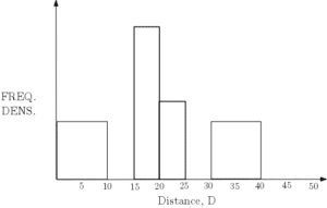
| Distance, D (km) | Frequency |
 | |
 | 15 |
 | |
 | 10 |
 | 20 |
 | |
 |
- Complete the histogram and the frequency table.
- Using midpoints, find an estimate for the mean time travelled (to one decimal place).
- What is the median distance travelled?
- Using linear interpolation, find estimates for the lower quartile Q1 and the upper quartile Q3.
Solution:
- We can see from the table that the number of people that travel between 20km and 25km is 10 and since the interval width is 5, the frequency density for this bar must be 2. This determines the scale for the frequency density and so can be added first. The missing numbers in the table can now be found by finding the areas of the given histogram bars. Similarly, the missing bars can be added using the figures in the table. The final figure and bar can be added ensuring that the total number of people is 100.

Distance, D (km) Frequency 
15 
15 
20 10 
20 
15 5 - An estimate for the total distance is given by summing up the midpoints multiplied by the frequencies:
 An estimate for the mean is given by
  The mean distance travelled to work by these 100 people is approximately 21.4km.
 - Since 50 people fall either side of 20km, this is the median distance travelled. (50th person = 19.75 also accepted, see part d).
- Q1 is estimated by the 25th person whereas Q3 is estimated by the 75th person. Firstly, the 25th person is the 10th person in the second interval. We can split the interval into 15, where we take the first person to travel 10km and the 15th to travel 14.667km. The 10th person is estimated to travel 13km, this is Q1. Secondly, the 75th person is the 15th person in the 25km-30km interval. Splitting this interval into 20 and taking the 15th gives Q3 as approximately 28.5km.

 An estimate for the mean is given by
  The mean distance travelled to work by these 100 people is approximately 21.4km.